The Calgary Flames have announced their "new" alternate jersey for their 30th Anniversary season, based on the style they originally wore when the Flames first moved to Calgary in 1980.
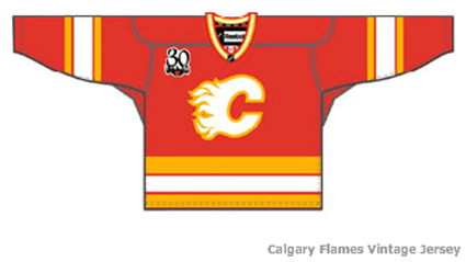
The jersey features a white Flaming "C" logo with yellow trim on a red jersey with yellow and white stripes on the arms and waist.
It also sports a 30th Anniversary patch on the right chest.
"All of the fans, they say 'What are you doing? Couldn't you just once think about bringing back that great and that venerable jersey?' Of course we not only thought about it, that's what we're going to do," Flames President and CEO Ken King said.
"I'm going to feel kind of nostalgic when I see that sweater, because that was our first sweater," co-owner Harley Hotchkiss said. "Sometimes I feel a bit lonely because I'm really the only one remaining of that original ownership group. I get some comfort of course from Jim Peplinski who's been around here for 30 years and can hold my hand whenever I'm feeling sorry for myself."
"We think it's important to honor our history, and we think it's as important to focus going forward," King said.
The jerseys will be worn a mere five times this season, once each against the Flames other five Canadian opponents, Edmonton, Vancouver, Montreal, Toronto and Ottawa.
We here at Third String Goalie fully support the Flames new alternate jersey, perhaps for reasons you may not have considered.
The reason we fully endorse the Flames return to the white "C" is not for wholly nostalgic reasons, but because it's so right that a red Flames jersey have a white "C" on it rather than a black "C".

Take a moment to look at the brightest spots of the fire, which are the hottest spots, pictured above. They are white, which is a hot color, as are red, orange and yellow. Now look at the areas of the picture which are NOT on fire. They are the coldest parts of the photo. They are the black areas. Black is a cold, dead, lifeless color and it makes no sense to use black for a flaming object, such as the Flaming "C" logo pictured below.
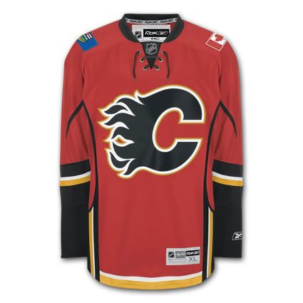
It just makes too much sense to us here at Third String Goalie to use a hot color to represent a flame, which is why we get a headache from how wrong the black "C" is that the Flames have been wearing for waaaaaaaaay too long now, which is why we endorse the Calgary Flames new "throwback" alternate with the white Flaming "C".
Here is the original red jersey's finest moment, capturing the 1989 Stanley Cup.






Amen, brother. A black C is just ash. The C should always be red. With all the concept drawings I've seen, no one puts a red C on the red sweater. It would look like the LA Angels. Sweet.
ReplyDelete